It’s the age of responsive design.

Microsoft Puts Mobile Front & Center
Bekah
We’ve been saying that ever since we started back in October 2010. When we set out to build Websites 360®, not many places were acknowledging the need to take their software, applications, and websites mobile.
Now, though, we’re starting to see some other major players in the industry acknowledge that mobile is hugely important if they want to stay relevant. The facts are just getting harder and harder to dismiss:
- Last year, smartphone sales overtook PC sales.
- Analysts predict that by January 2013, one in six people across the globe will be accessing the web through their phones.
- Apple reports that within two years of launching the iPad, it sold 67 million of them - especially shocking considering it took them 24 years to sell that many Macs.
People clearly like portable devices.
Most recently, a company you may have heard of has jumped on the responsive bandwagon.
Microsoft is releasing Windows 8, Internet Explorer 10, Windows Azure (a cloud-based hosting platform for apps), a new version of Windows Phone, and Windows Surface, their own tablet. These aren't just slightly tweaked iterations, but all-new reinventions that Forbes magazine says are “designed from the ground up for the world of mobile.” Forbes asserts that in this area “Microsoft is actually more design-forward than Apple.”
Wow.
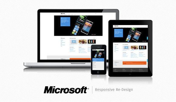
Microsoft is also redesigning their own website to make it fully responsive. Like our site and every site built with Websites 360®, the new Microsoft.com (click to preview) is built on a flexible grid layout. Content snaps into place according to the size of the screen it's being viewed on.
(You can check this out right now by grabbing the sides of your browser window and dragging it smaller. See? You don't have to scroll from side to side to see everything in the window. It just adjusts to the new size on its own.)
So, what does this mean for you?
Well, if you're a mobile user, it's a step in the right direction - toward making mobile a must for all the tools you rely on (or could rely on if they were available on-the-go). And for those of you who use Windows, it's another way to streamline your work processes so you can do whatever you need to wherever you are. So there you have it.
Responsive for the win.
